
The Art of Saying Everything Without a Single Word
In entertainment marketing, we talk a lot about rollout strategy, about the press releases, the playlist pitching, the influencer seeding. But the most powerful piece of communication an artist will ever release? Often, it’s the cover art. Before a single note plays, before a review drops, the artwork is already doing the heaviest lifting. It is the first press release. The first brand statement. The opening argument.
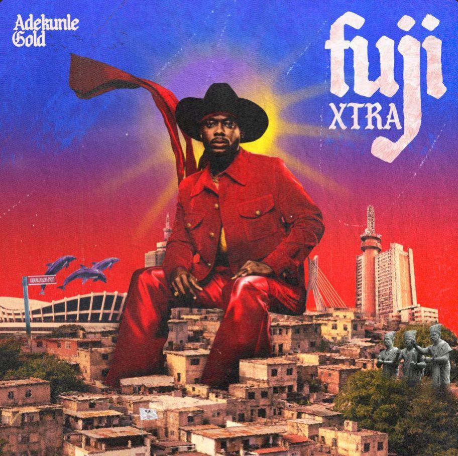
Adekunle Gold’s Fuji Xtra cover is a masterclass in this.
Let me tell you what I see, not as a fan, but as a brand strategist.
He Is Literally Sitting on Lagos.
The central image is not subtle, and it isn’t meant to be. AG is seated regally, deliberately and atop a dense Lagos Island neighbourhood, dressed head-to-toe in commanding red. He towers over the skyline. This is not an artist on a cover. This is a statement of ownership. In brand language, this is called category dominance visualised. He isn’t claiming to be from Lagos. He is Lagos.
Every Background Element Is a Receipt.
And this is where the creative direction becomes genuinely brilliant, because nothing in that background is decorative. Everything is evidence.
The National Theatre sits to his left, not coincidentally, the same venue where he staged his headline concert. The cover art is simultaneously a gig poster for anyone who knows.
The Lekki-Ikoyi Link Bridge anchors the right. One of Lagos’s most iconic contemporary landmarks, grounding the artwork in the modern city.
The Adekunle Kosoko Street sign appears somewhere along the left. A street bearing his family name. This is not ego; this is lineage.
The Kosoko Palace and the Three Statues of the Ogboni are ancestral markers. Deep cuts for those who know Lagos Island history. The Ogboni fraternity is one of the oldest and most influential cultural institutions in Yorubaland. Referencing them here says: this music doesn’t begin with me. I am the continuation of something ancient.
The flying dolphins are the surrealist flourish, because Lagos is a coastal city, water is identity, and the dolphins signal that this creative world bends reality. It gives the artwork its dreamlike, larger-than-life energy.
The Colour Strategy is Intentional.
Red. Deep blue. A burning golden centre. These are not colours chosen for aesthetics alone. Red is power. Blue is depth and history. And Gold? Well, that’s always been his name. The palette doesn’t just look good. It communicates: royalty, fire, cultural pride.
The Typography Does the Genre Work.
The word fuji is rendered in a gothic, almost folkloric typeface. It nods to the genre’s deep Yoruba Muslim roots while sitting comfortably in the contemporary visual language of global album art. It bridges without apologising.
The best album covers are not photographs. They are arguments. They argue for an artist’s place in history, their relationship to geography, their cultural authority. Think of Fela’s covers; the political cartoons that told you everything about the man before you pressed play. Think of what Burna Boy did with African Giant. This tradition of using cover art as manifesto runs deep in African music, and AG is firmly in that lineage.
Fuji Xtra is not just an extension of an album. It is an extension of a brand identity, the one that says: I am Adekunle Kosoko. I am Lagos Island royalty. I carry Fuji music, a Lagos-born genre, and back home to the stages and streets that birthed it. And I did it sitting down.
That is how you communicate without saying a word.